Header & Footer
For the sake of brevity in our documentation, we will use the term marginals to collectively refer to headers and footers.
Headers and footers allow you to automatically insert markdown content or custom React components at the beginning and end of your notes. The distinct advantage here is the capability to configure marginals individually for each note type, offering tailored interfaces for notes of various purposes.
Configuration Syntax
Marginals belong to the style section and can be specified as:
type TypeName {
    style {
        header = <#FUNCTION | #EXPR | #MARKDOWN>
        footer = <#FUNCTION | #EXPR | #MARKDOWN>
    }
}
Markdown Marginals
When you simply need to introduce basic content elements like headers, text, lists, or code blocks, utilize markdown. Here's how to specify a markdown marginal:
type TypeName {
    style {
        header = md"""
            Some **markdown** content.

            ```dataview
            some query
            ```
            ...other content...
        """
    }
}
The tags markdown and md both indicate a markdown string.
React Marginals
For a more customized experience, React components come into play. There are two primary methods to define them:
1. Function Approach
Utilize the fn or function tag to script a function returning a React component:
type TypeName {
    style {
        header = fn"""
            import {Anything} from "anywhere"
            // process as required
            return <Anything>{any <b>react</b> element}</Anything>
        """
    }
}
2. Expression Approach
If your function is succinct, limited to a single expression such as:
type TypeName {
    style {
        header = fn"""
            return <div>I am a header.</div>
        """
    }
}
You can simplify it further using the expr tag:
type TypeName {
    style {
        header = expr"""<div>I am a header.</div>"""
    }
}
Context Variables
Static Context
Accessible in every fn and expr:
note: The currentNoteobject.api: The globalTypingAPIobject.
Dynamic Context
Contained within the ctx object with the following properties:
container: The HTML container designated for the marginal.component: The ObsidianComponentobject associated with the current block.reload(): Triggers a rerender of the current marginal.disableAutoreload(): Disables automatic rerendering of the current marginal on metadata change.on(event, callback): Registers a callback for events from theapp.metadataCache.register(callback): Sets a callback to be invoked when the marginal is unloaded.registerEvent(eventRef): Registers an event reference to be detached during the unloading of the marginal.
Error Handling
Should any errors occur while rendering the marginal, an error block will replace the marginal. This block can be expanded to view a comprehensive stacktrace, aiding in debugging.
Example
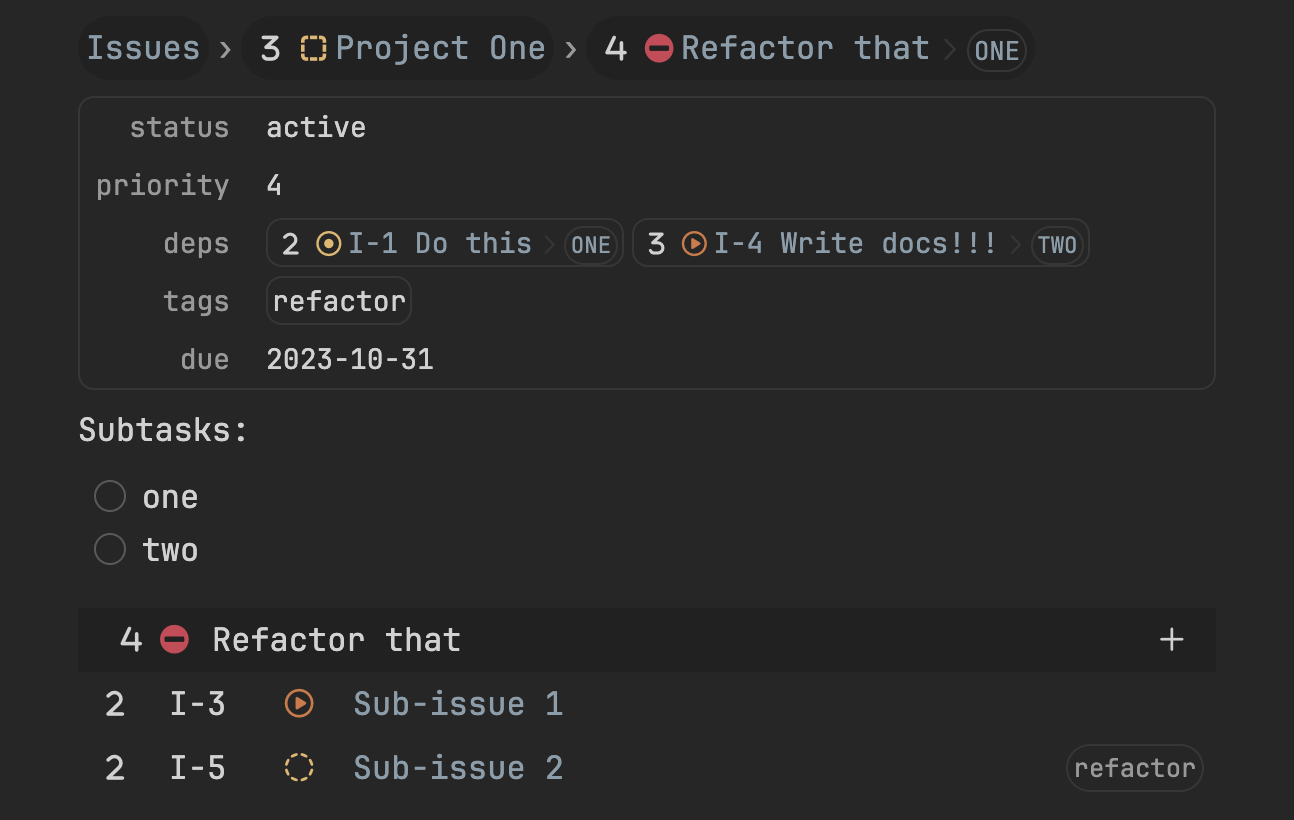
- OTL
- Source View
- Preview View
type Issue {
    style {
        header = fn"""
            import {Breadcrumb} from "packages/breadcrumb"
            import {Wikihead} from "packages/wiki"
            return <>
                <Breadcrumb note={note} base={"apps/Issues.md"} />
                <Wikihead note={note} exclude={["in"]} />
            </>
        """
        footer = fn"""
            import {IssueFooter} from "./footer"
            return <IssueFooter note={note} />
        """
    }
}
status :: active
priority :: 4
in :: [[PRJ Project One]]
due :: 2023-10-31
deps :: [[I-1 Do this]], [[I-4 Write docs!!!]]
tags :: "refactor",

Subtasks:
- [ ] one
- [ ] two